art + design department rebrand
Bethel University’s Art + Design Department is a vibrant, highly customizable experiential program allowing students to major or minor in various forms of analog, digital, and fine art. Its branding needs to encompass the versatility of the program while maintaining a sense of professionalism, appealing to prospective students, current students, parents, and alumni. The brand needs enough room to carry across several platforms in a recognizable way.
Research initiatives included situational audits of Bethel University's web and media branding, internal guidelines, and the Art and Design Department's existing promotional material. These, paired with interviews with students both inside and outside of the department, found that art and design students want to broadcast both their creativity and aptitude in terms of a sustainable career path .The department aims to emphasize the creative process in a highly individualized format allowing students to get ahead in their careers while growing independently in creative pursuits.
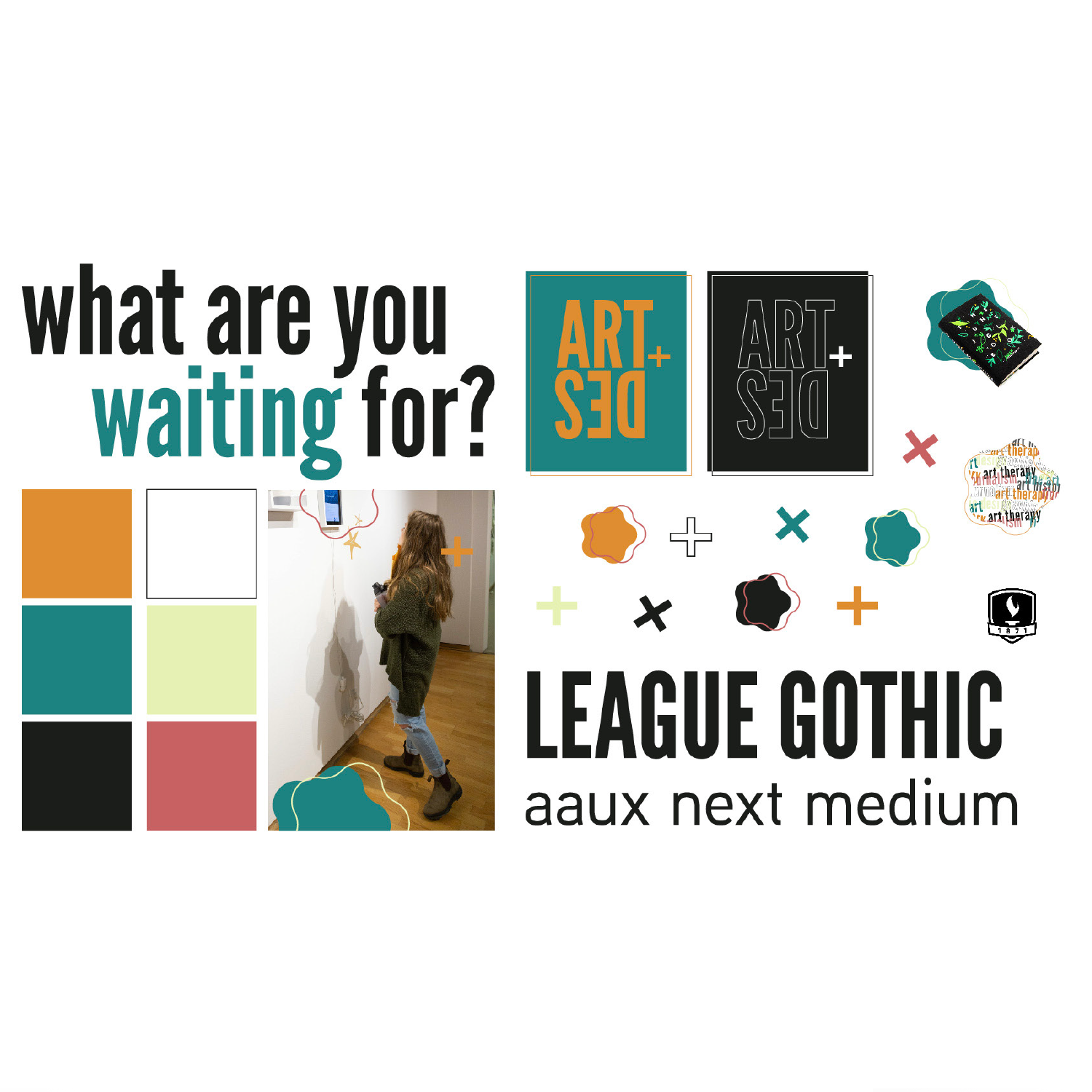
These final brand guidelines utilize a combination of sans serif typefaces, using a bolder, thicker look for headers and an easy-to-read, lighter body copy typeface. The color palette allows for warm and cool variations while also playing off of Bethel University’s blue and gold identity. Contrasting more fluid shapes with the sharp lines of plus signs created a visual messaging that corresponded with the intersection/building theme of the department branding as a whole.
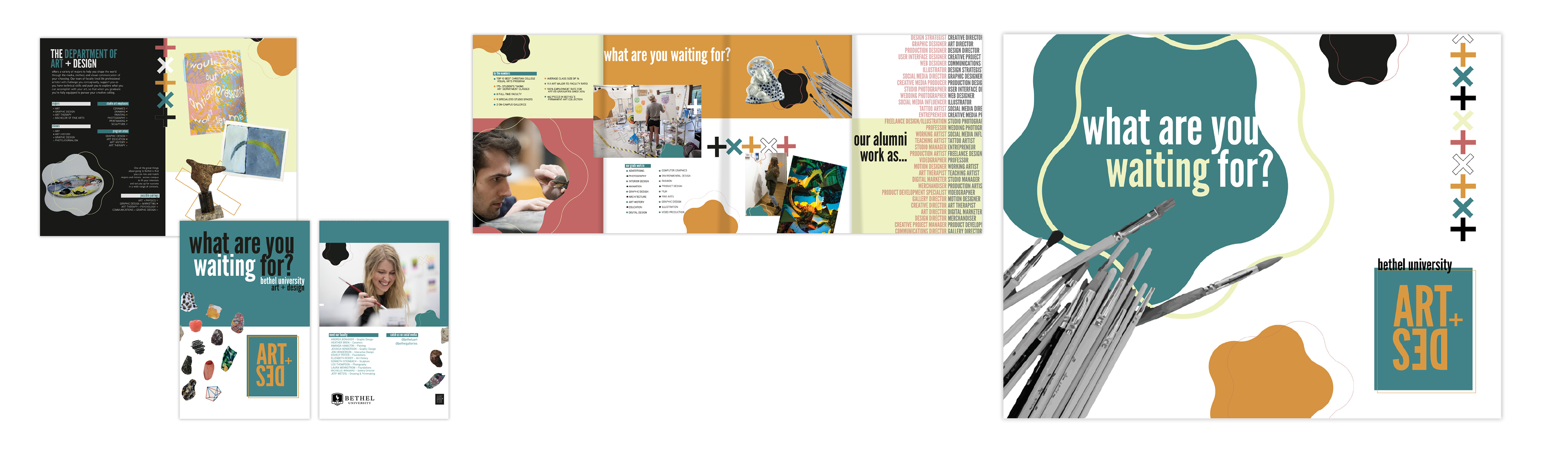
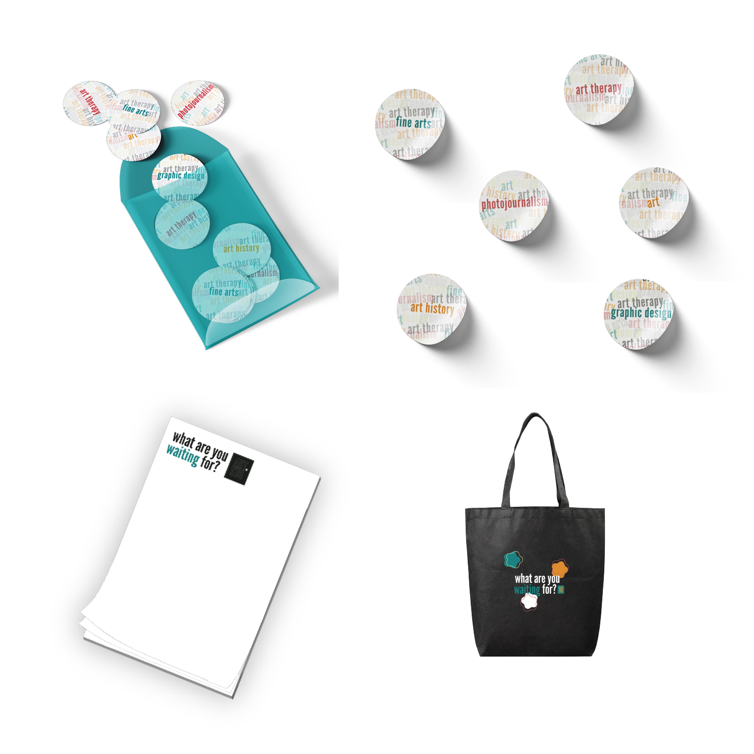
The brochure aims to appeal to prospective students by emphasizing the creative freedom and range of disciplines the department provides. It shows both students at work and the art they’ve created. It also appeals to parents and donors by making note of career success of alumni and including statistics about the value of the program. The back of the folded-out brochure serves as a poster students can hang in their dorms or homes, a visual reminder of the options ahead of them as well as a print that may engage viewers and double as a conversation point.
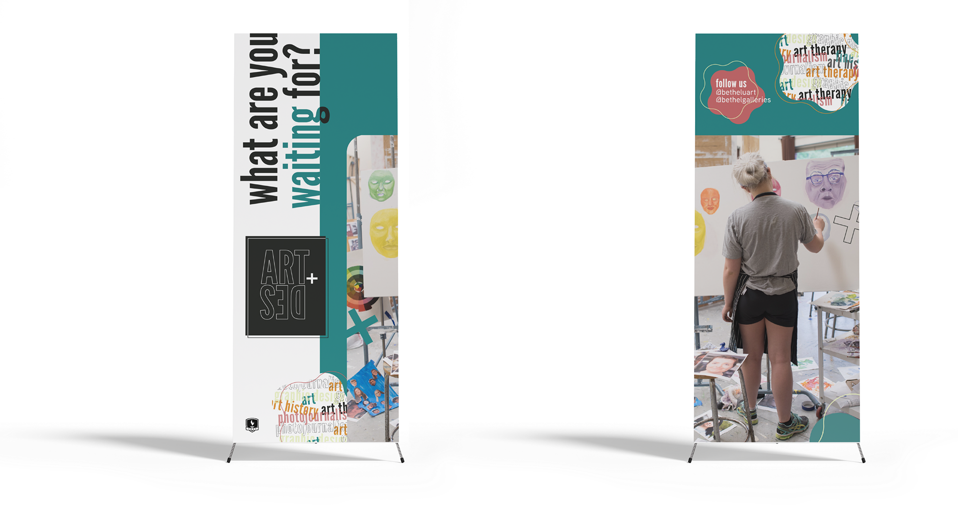
These banner stands can stand alone or as a pair, recognizably representing the department brand and providing an action item for viewers waiting in line at an informational table or in a registration line. It grabs attention with a large image, advertises the degrees offered in a creative format, ties Bethel University into the branding via a left-corner logo, and drives traffic to social media pages.
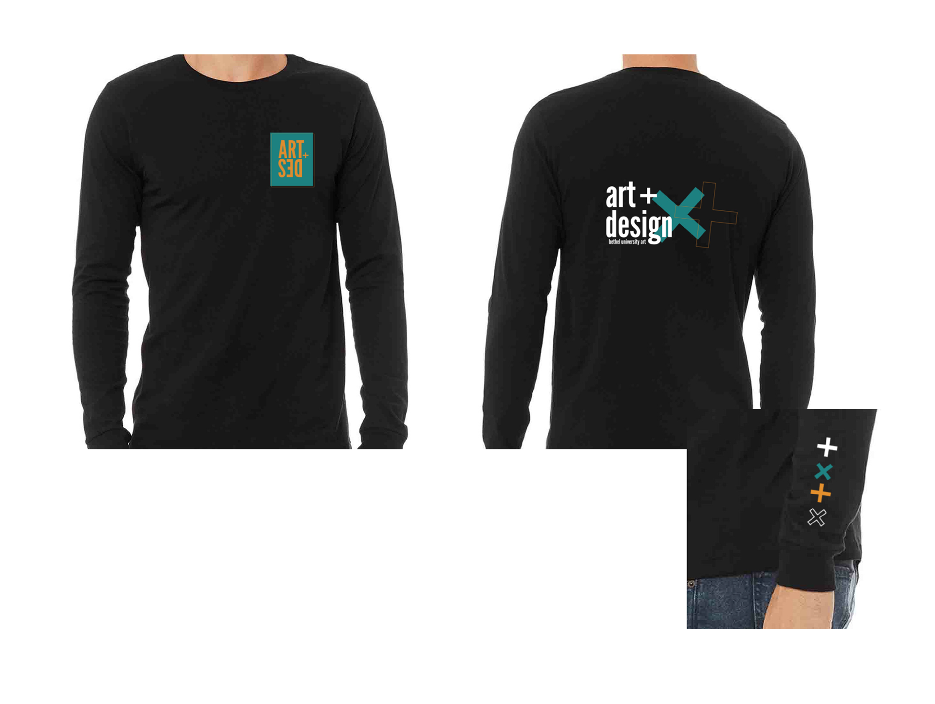
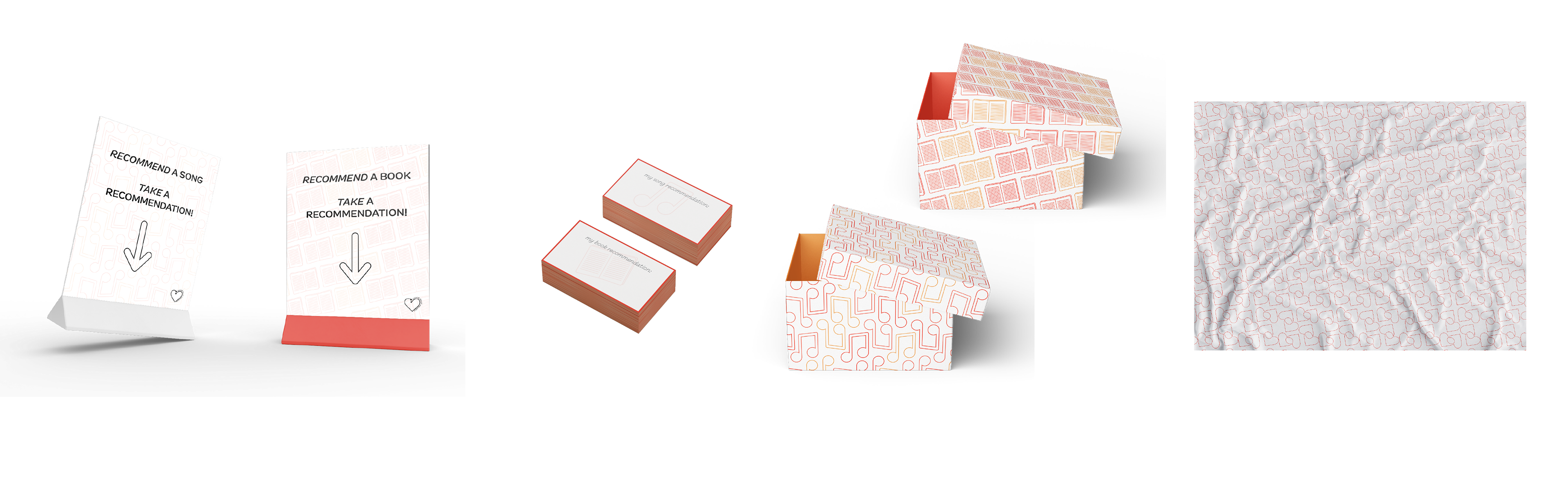
Department merchandise can serve as both a fundraising opportunity and a marketing expansion campaign. By creating materials students and faculty want to wear or use, the logo, tagline, and brand identity of the department are taken even more places physically. These options cover a range of prices and materials.
Department merchandise can serve as both a fundraising opportunity and a marketing expansion campaign. By creating materials students and faculty want to wear or use, the logo, tagline, and brand identity of the department are taken even more places physically. These options cover a range of prices and materials.
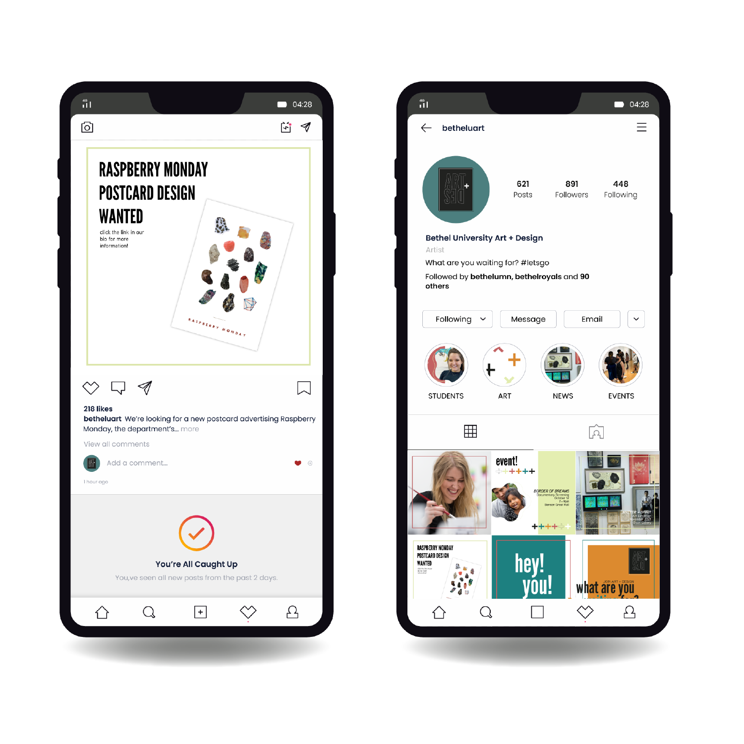
This Instagram feed sample shows how various adaptable templates form a cohesive messaging system both on a user feed and homepage.
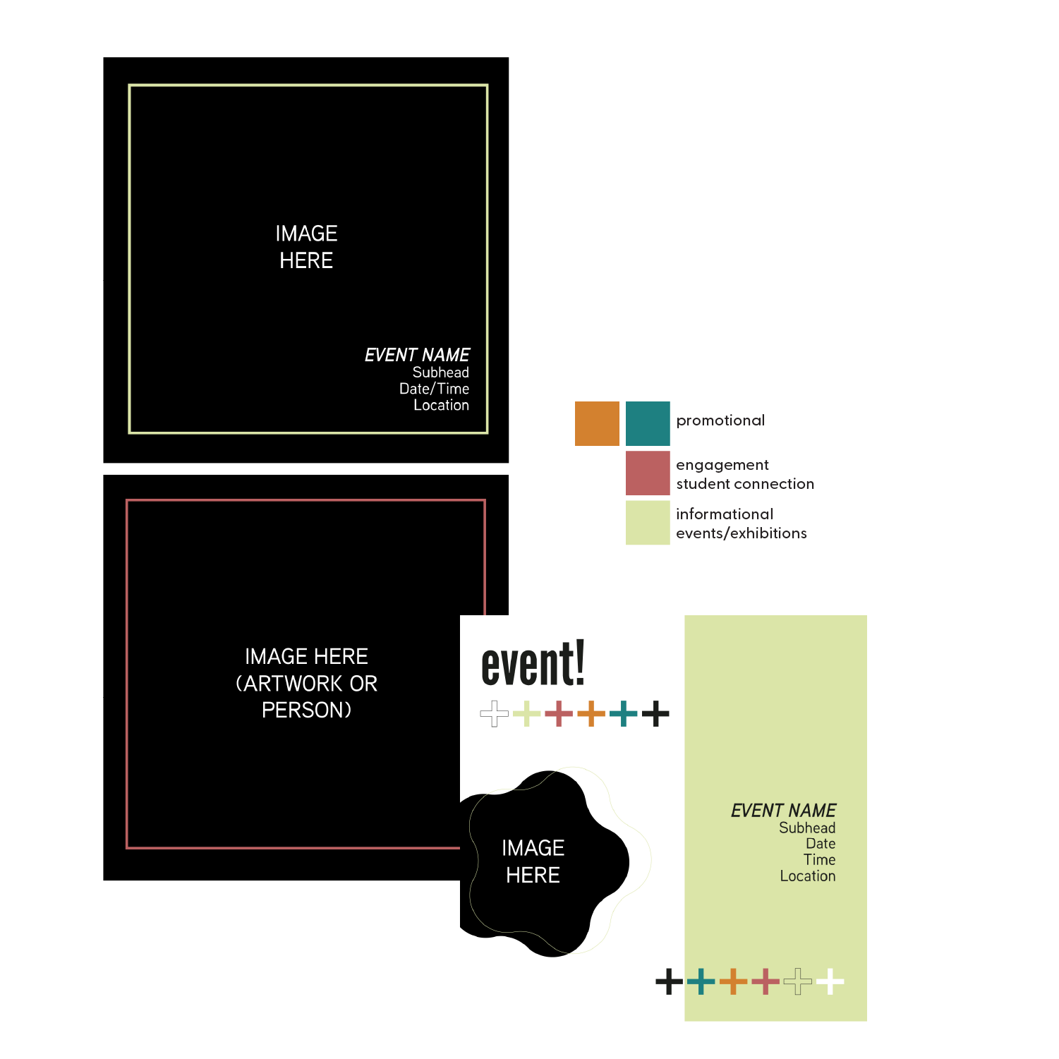
These templates are easily filled in Adobe or Canva, each color or color pair corresponding to a certain facet of Instagram posts. The simplicity of the large square images allows artwork and portraiture to speak for itself while giving details in a straightforward format. The event template allows art students to keep track of the functions they must attend throughout the semester while keeping attendance open to the broader audience.
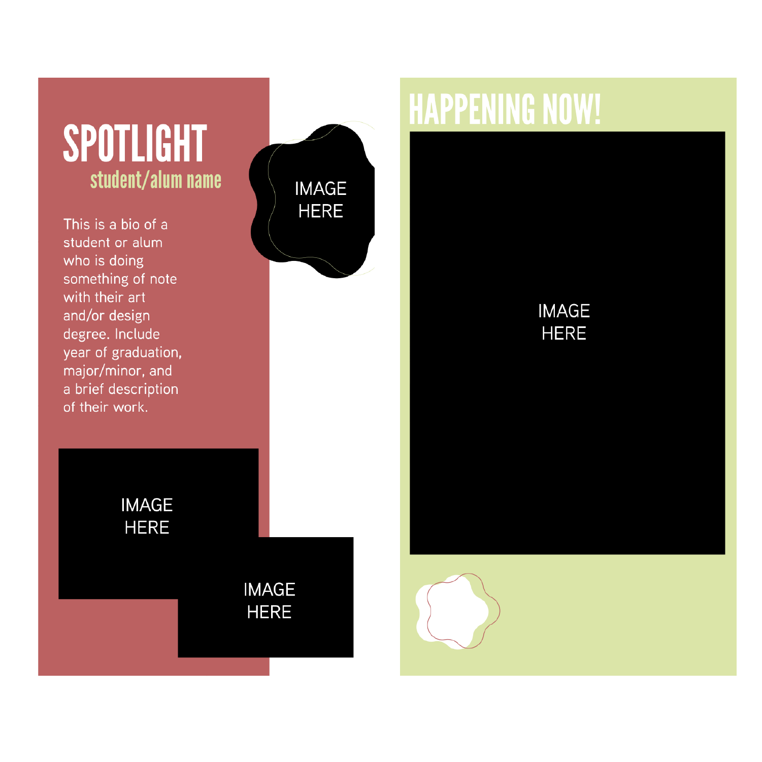
Easily adjustable spotlight templates let students, alumni, and faculty highlight their work and accomplishments, providing evidence of art as a sustainable career path and creating more story-sharing opportunities. By dropping a picture or video of a live event in the rectangle on the right, relevant events are advertised visually and textually.

Linking Spotify playlists catered to specific facets of the department are a fun, interactive way for viewers to see what the department is up to and spark conversation about music in relation to art. Curated playlists, in a world dictated by very specific mood playlists, also show the department is up to date and adaptable. Using the Instagram story question function lets users interact directly with the department and gives them a chance to make their voices heard. Consequently, when question responses are shared on new story posts, those who responded are more likely to repost the story to their own accounts, reaching new audiences and driving more traffic to the account. The wallpaper patterns provide opportunity for viewers to screenshot the art and set it as their cell phone wallpaper, serving as free advertising and story engagement at the same time.
morningstar coffee truck rebrand
Morningstar Coffee needs to capitalize on the visual nature of their name, marketing fair-trade, organic blends to a frequently on-the-go audience of festival-goers and city families. By creating a recognizable, bright energy that consistently appears inside and outside of the company’s coffee truck, engagement and aesthetic value increases and Morningstar becomes more than another cup of coffee.
Research included situational audits of Morningstar's social media and web presence and analyses of other coffee and food trucks focusing on organic, fair-trade sources. This revealed a need for consistent branding across platforms and a company mission of working within the Twin Cities community to distribute and appreciate authentic blends for customers to wake up with the sun.
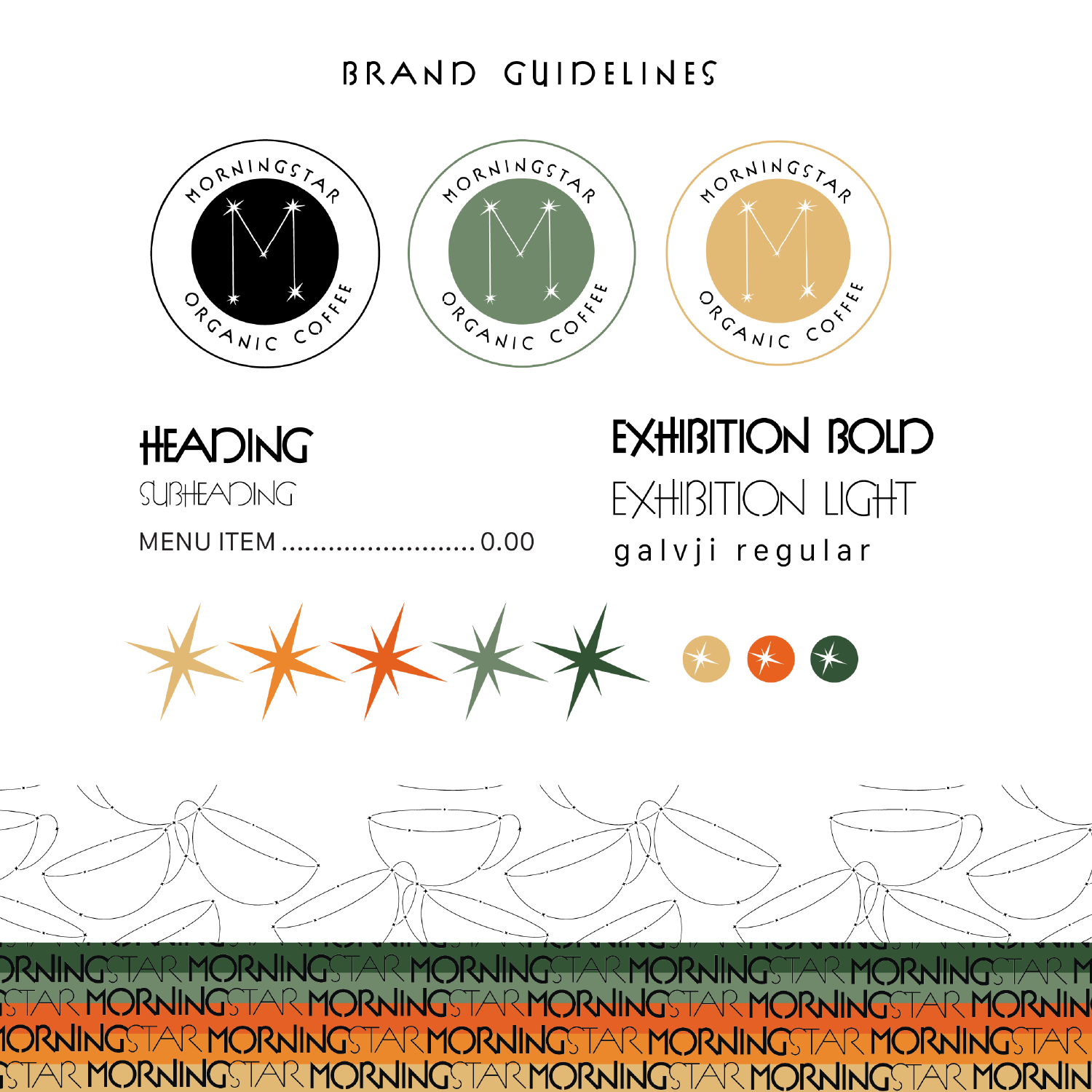
The final Morningstar Coffee brand guidelines use a range of warm, earthy tones to place emphasis on the natural origins of the company’s coffee blends. Creating a constellation pattern in the shape of a coffee cup capitalizes on the visual potential of the company name, and a more reserved use of the same concept paired with a quirky display type allows contrast between the badge logo, wordmark, and background patterns.
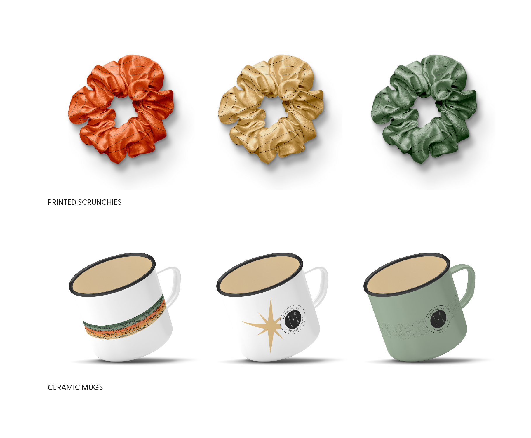
This branded merchandise provides customers with relevant and applicable items like mugs to hold their Morningstar blends while getting creative with trendier options like patterned scrunchies.
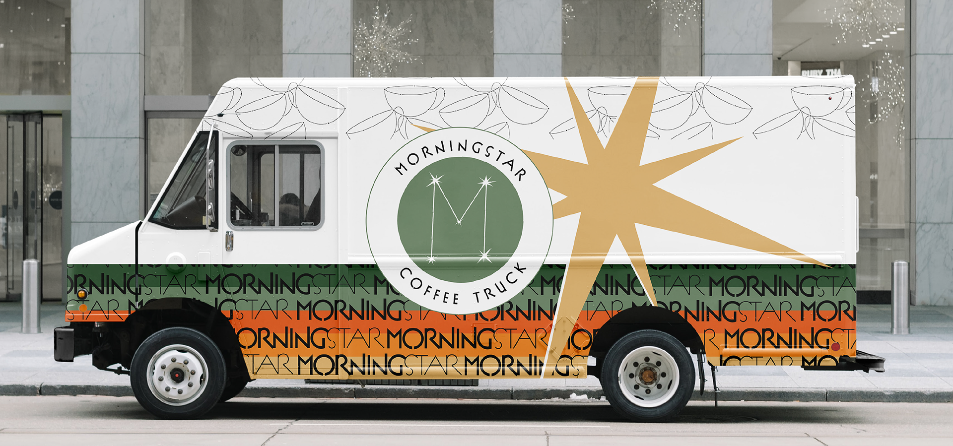
The driver’s side of the truck grabs attention immediately with an easily readable logo and star iconography. The starburst shape extends to the top of the truck, and the pattern strips on the top and bottom wrap around to the passenger side so that the path of the eye is not limited to one side of the vehicle.
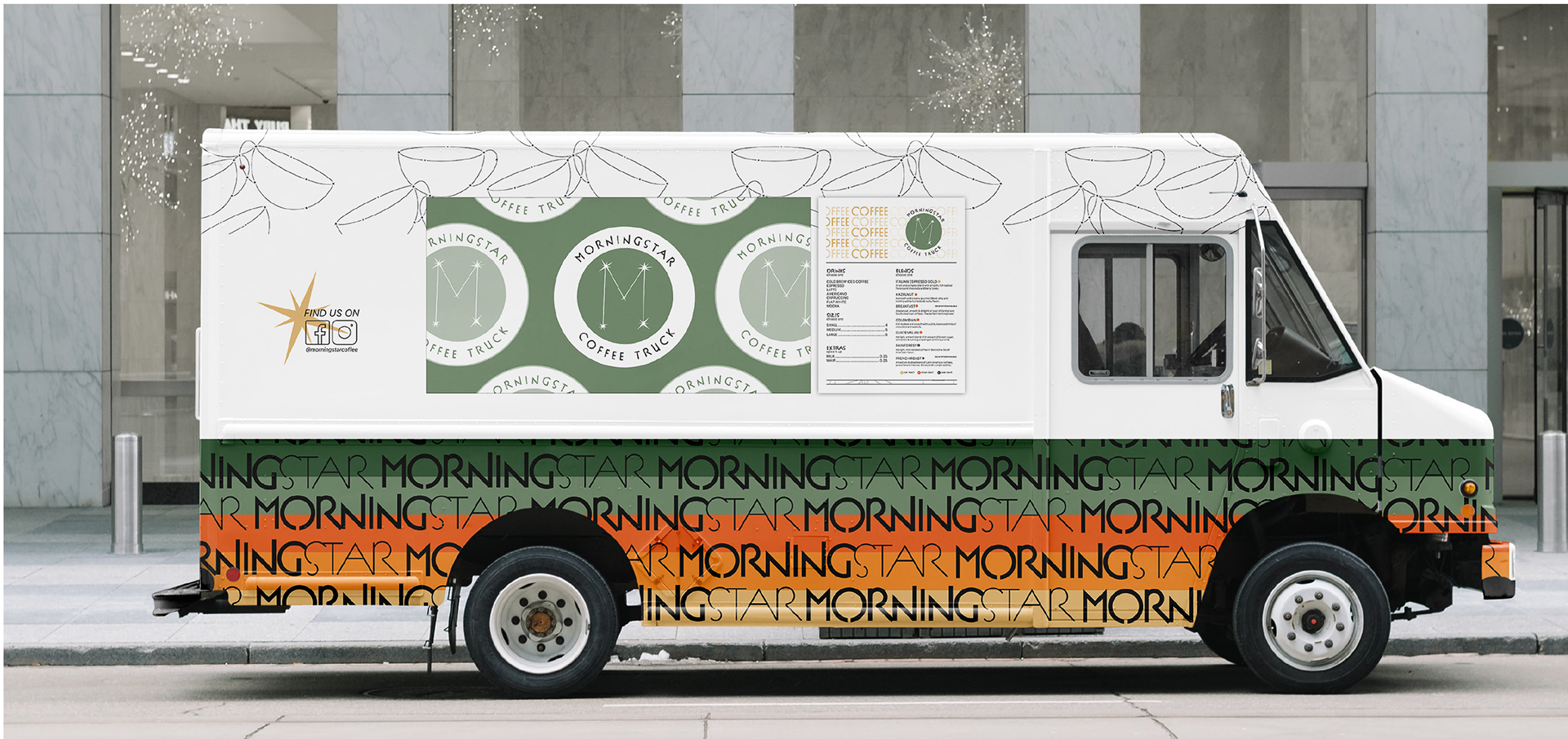
The passenger side includes social media information so that those whose interests are peaked by the passing truck know where to go for more information. The fold-up flap that serves as the order window has a pattern that adds to the truck’s appearance when closed but is not vital, so no impact is lost when the window is open. The menu is enlarged and mounted beside the window for ease of ordering.

The colored star icons beside each blend denote the intensity of the coffee roast: light, medium, or dark. Because Morningstar focuses on a variety of organic blends rather than coffee-chain-style specialty drinks, the menu serves as a guide for customers to build their drinks by selecting a base type of beverage, a blend, a size, and additional features like milk or whip.

The branding merchandise caters to an audience ranging from teens to adults, utilizing trendy, practical items like tote bags and customizing the to-go cup so that customers walking around with Morningstar beverages broadcast what they’re drinking.
study abroad grant project
Bethel University’s Office of International and Off-Campus Studies, where I work as a graphic designer and peer advisor, received a $500 grant from International Student Exchange Program (ISEP) to create print advertisement resources for events related to off-campus study. Working within the financial constraints of this grant and the print assets selected by my supervisors, I implemented an easy-to-recreate brand across the board.
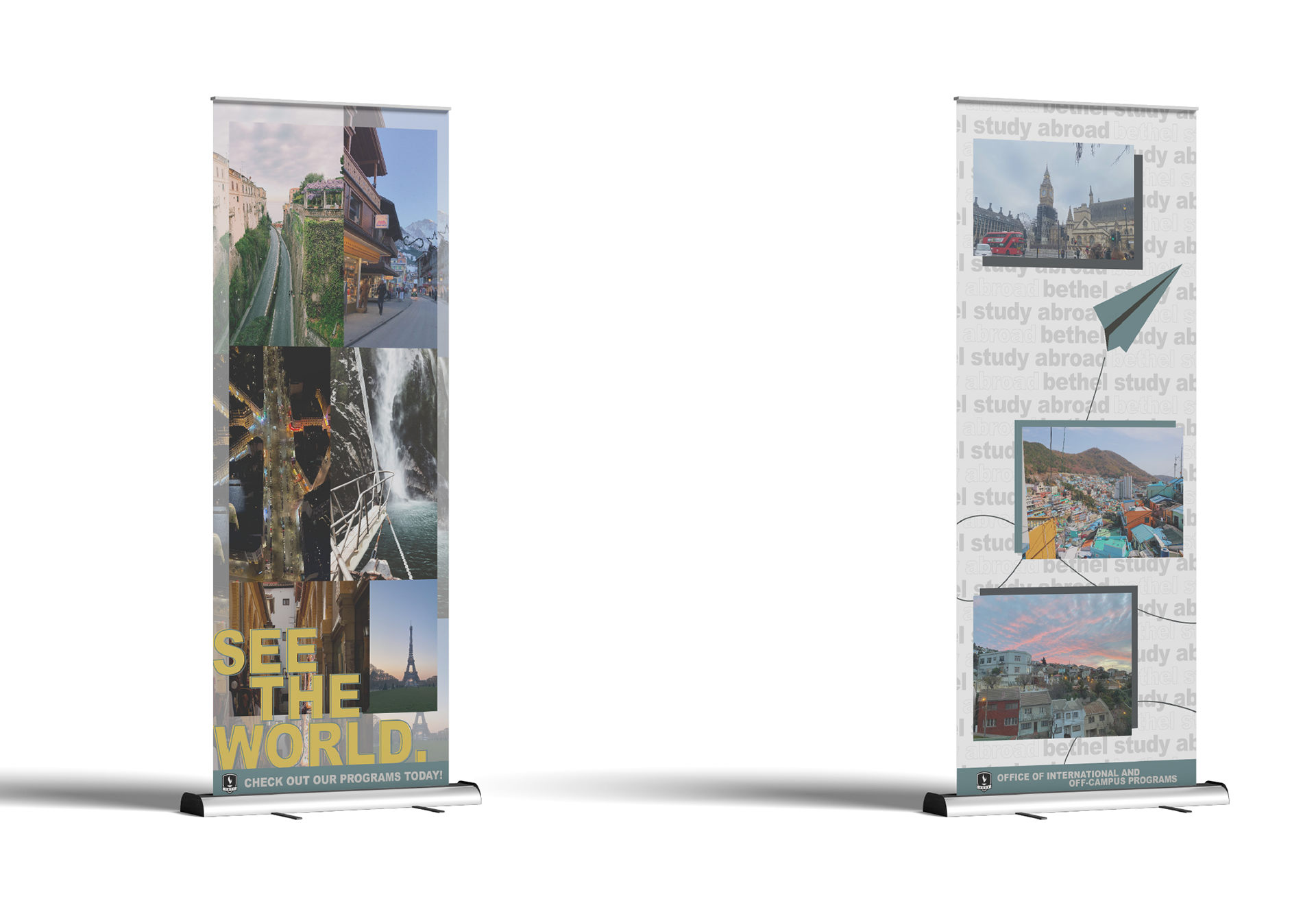
These retractable banner stands can be displayed at any event relating to studying abroad, and the footers not only link each banner together but represent both the office and the university itself. The banners showcase images taken by Bethel students during their time abroad.

These 16 x 20 easels printed on PVC board put potential destinations at the helm and give only the information necessary to guide readers to an event. The lack of a time, date, or location intentionally allows the easels to be reused each year, and the recognizable serif lettering and color scheme tie the prints into the office’s overall branding.
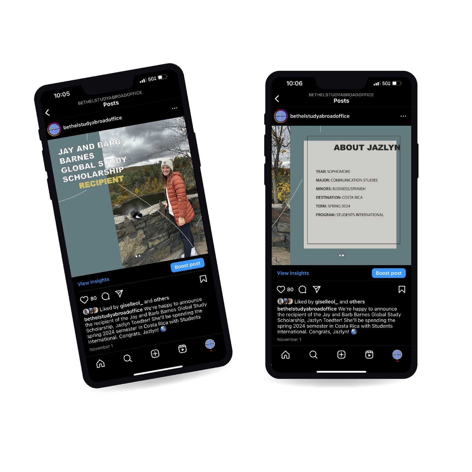
Several Instagram initiatives use photographic emphasis to highlight students currently studying abroad.

Creating feed posts with multiple images allows for a continuous effect for users swiping to other slides. As a bonus, if an Instagram viewer passes a post without swiping to other panels, it reappears in their feed focused on the next image in the carousel post.
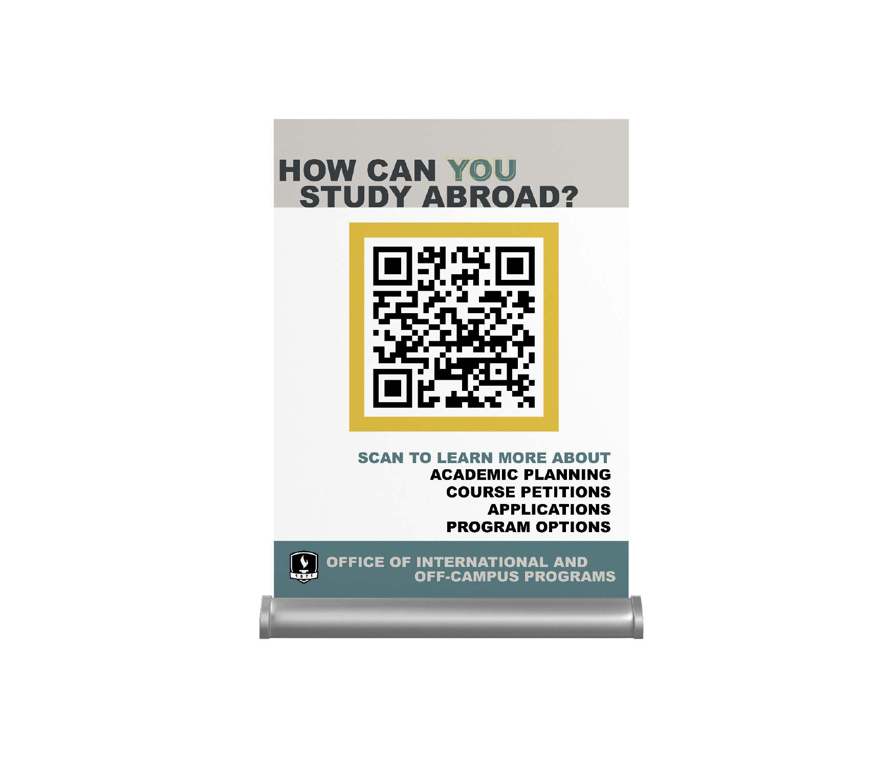
This 8.5 x 12 inch tabling material emphasizes a QR code leading to the department website, which gives students all the information they might need to know about studying abroad and the various programs available.
poster gallery
From social cause awareness posters to scholarship and conference advertisement, these posters utilize a combination of Adobe programs to effectively pair verbal and visual messaging.
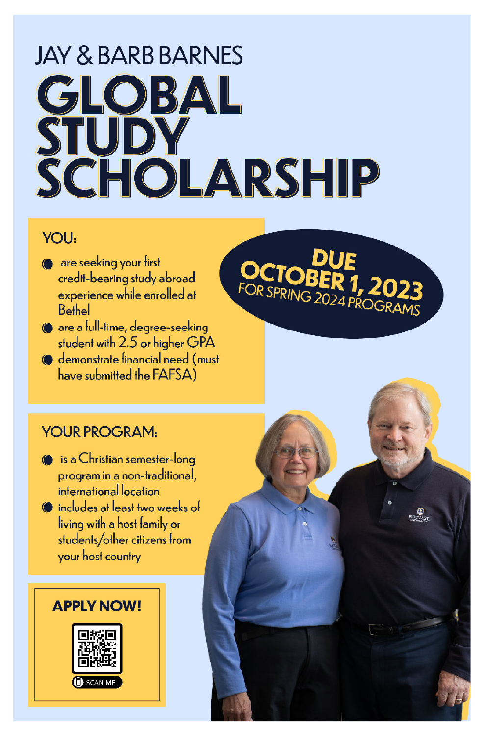
Advertising a new global study scholarship opportunity for Bethel students planning to take a semester abroad via a Christian program in a non-traditional, international location.
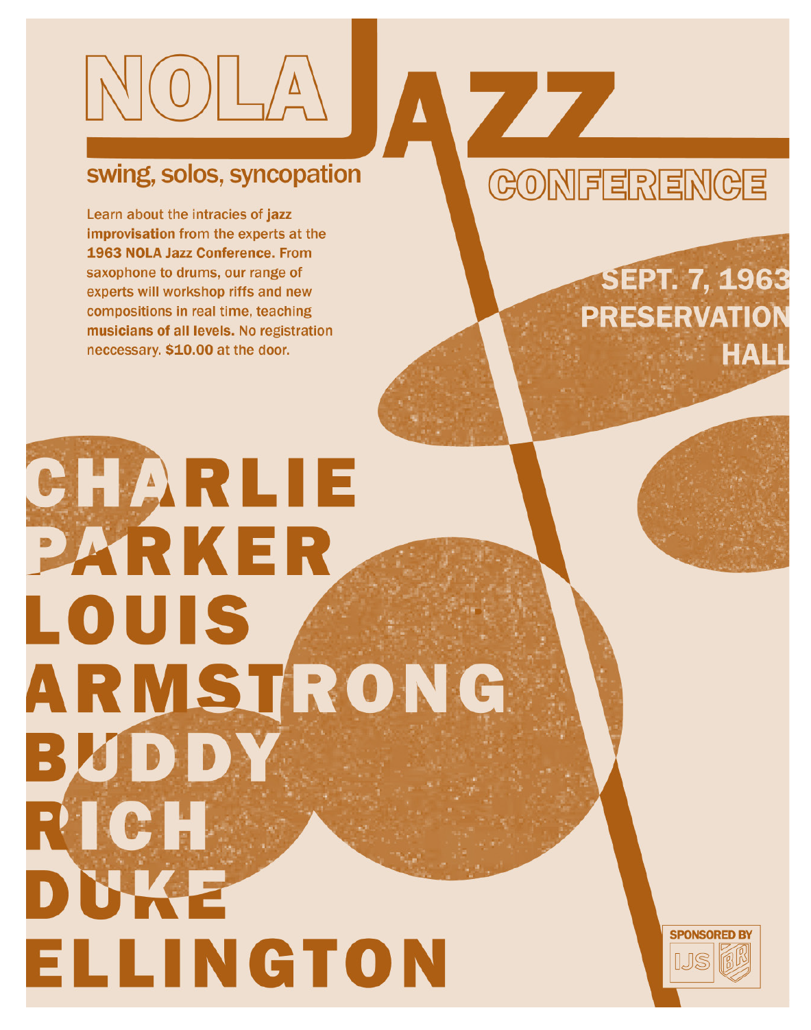
A promotional poster for a fictional jazz conference taking place in New Orleans in 1963 and featuring some of the biggest names in big band music.
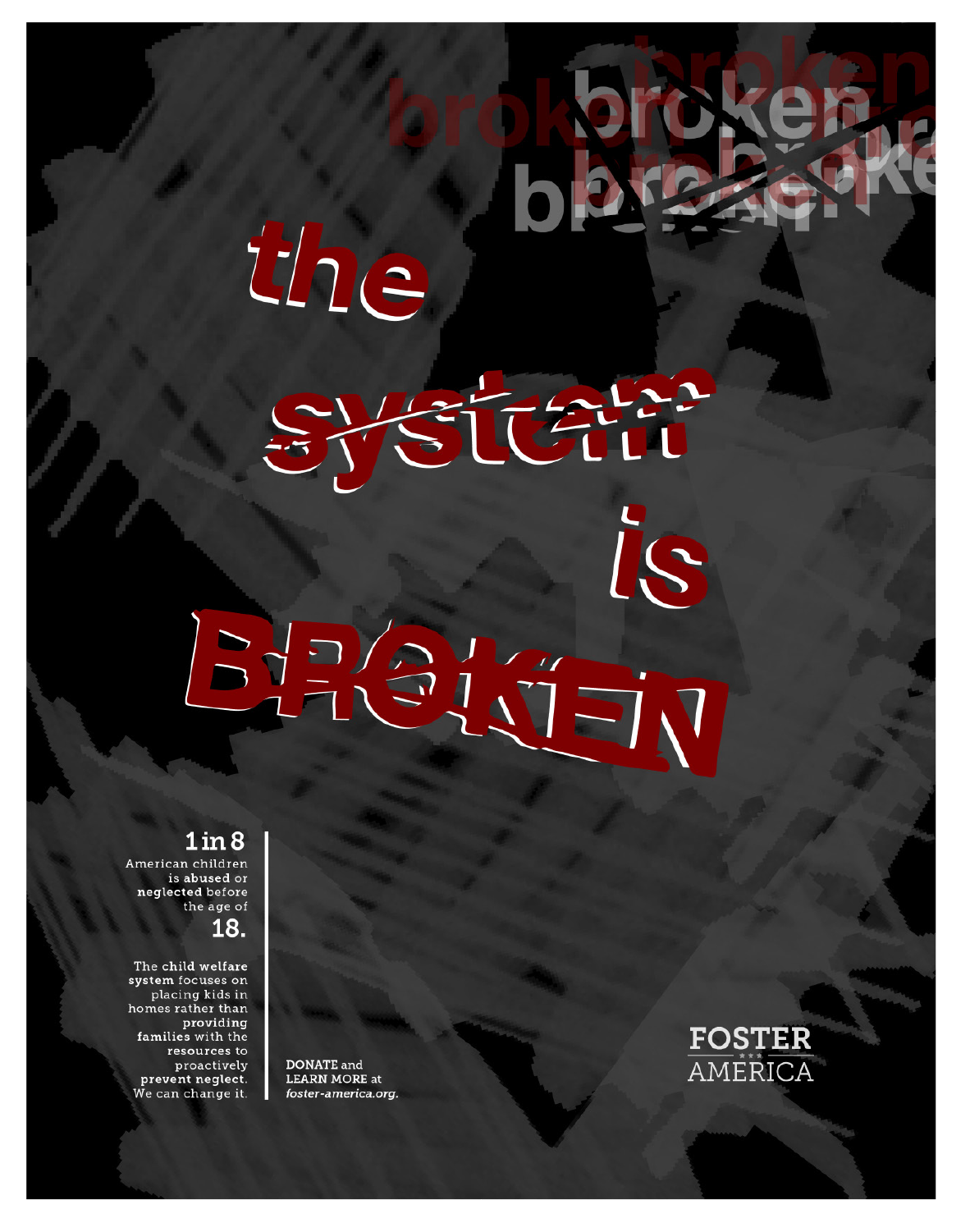
Informational awareness poster focused on the injustices of the American child welfare system.
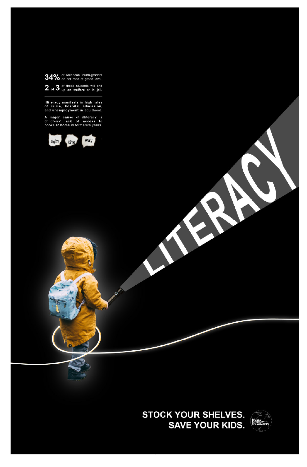
Informational awareness poster focused on the lack of literacy for young children outside the classroom.
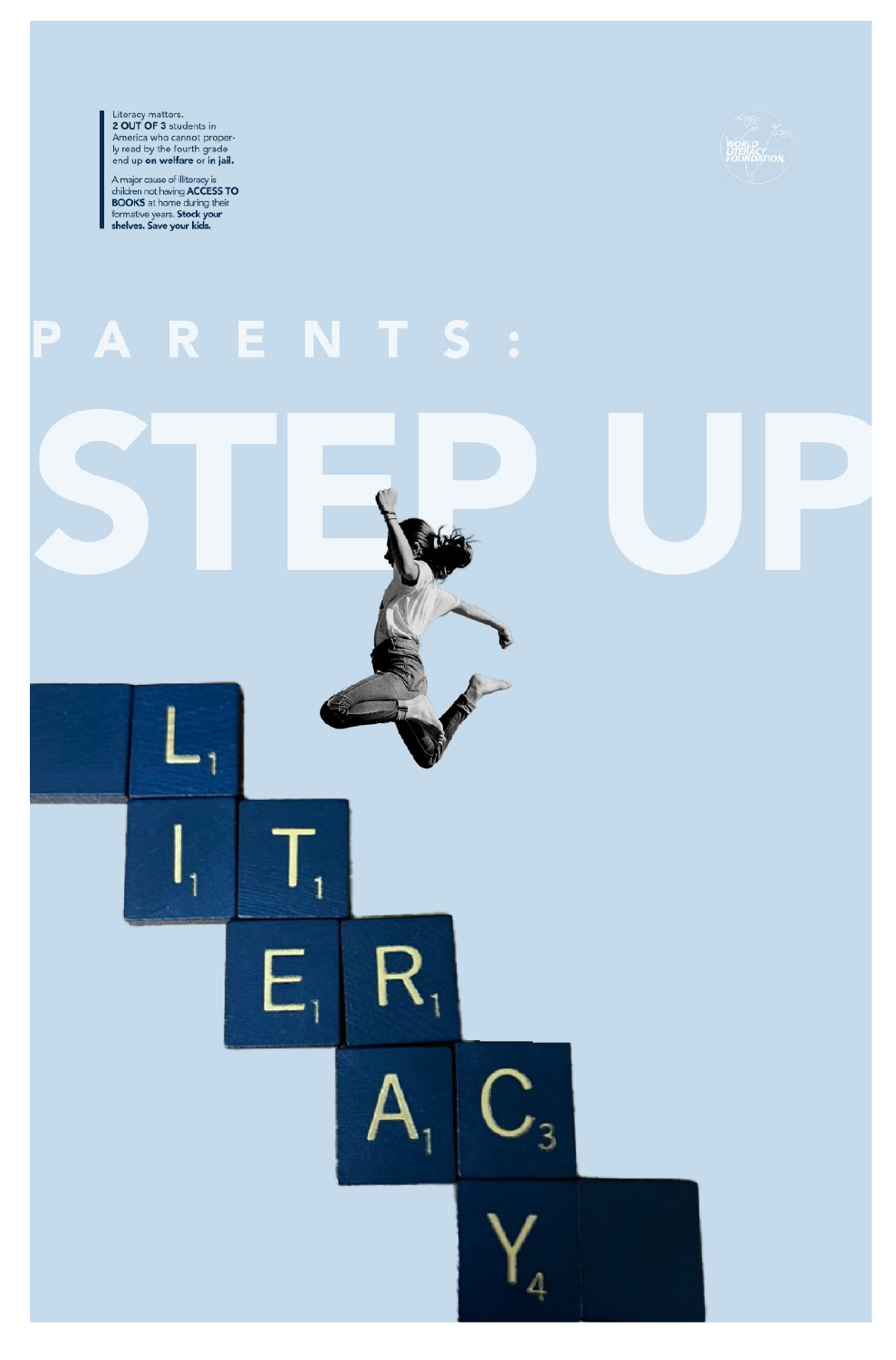
Informational awareness poster focused on the lack of literacy for young children outside the classroom.
day of unplugging engagement campaign
On a college campus where students and faculty alike constantly have their eyes glued to a phone screen, the National Day of Unplugging initiative seems an apt choice for a public awareness campaign to decrease screen time while increasing engagement within the campus community.
Through interviews with college students about their screen time and perceptions of mobile usage and situational audits of past National Day of Unplugging campaigns, I found that phone users value being in the know and are afraid of missing out. Constant access to the answers of the internet have depreciated the value of art and knowledge, and students need to learn to reconnect with their emotional expression in a non-digital format.

The final brand guidelines combined the physical engagement aspect and warm color scheme of two of the mood boards. The concept of a heart being a cord, initially conceived in the neon sign format, was adapted to show hearts unplugged but still retaining their shape. A typeface with a more handwritten theme and a heart background pattern evoke the paper-and-pencil feel of the event.
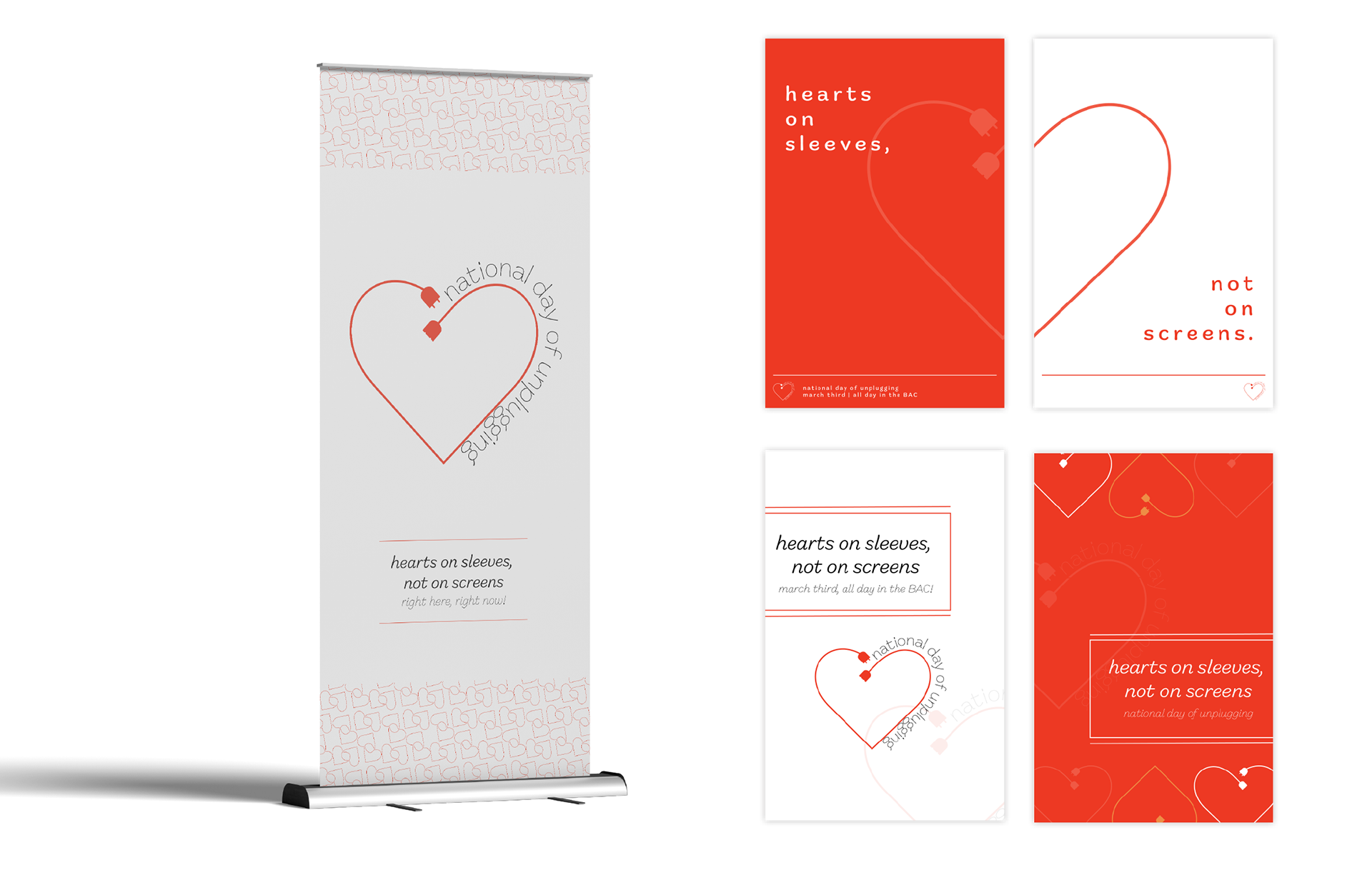
These posters function in pairs, but when placed alone still draw attention and peak curiosity. They use a minimal color scheme to implement a recognizable brand, giving only the information necessary. The banner stand can be placed anywhere near tabling or the display wall during the event.

These promotional Instagram templates offer engaging carousel-style feed options.
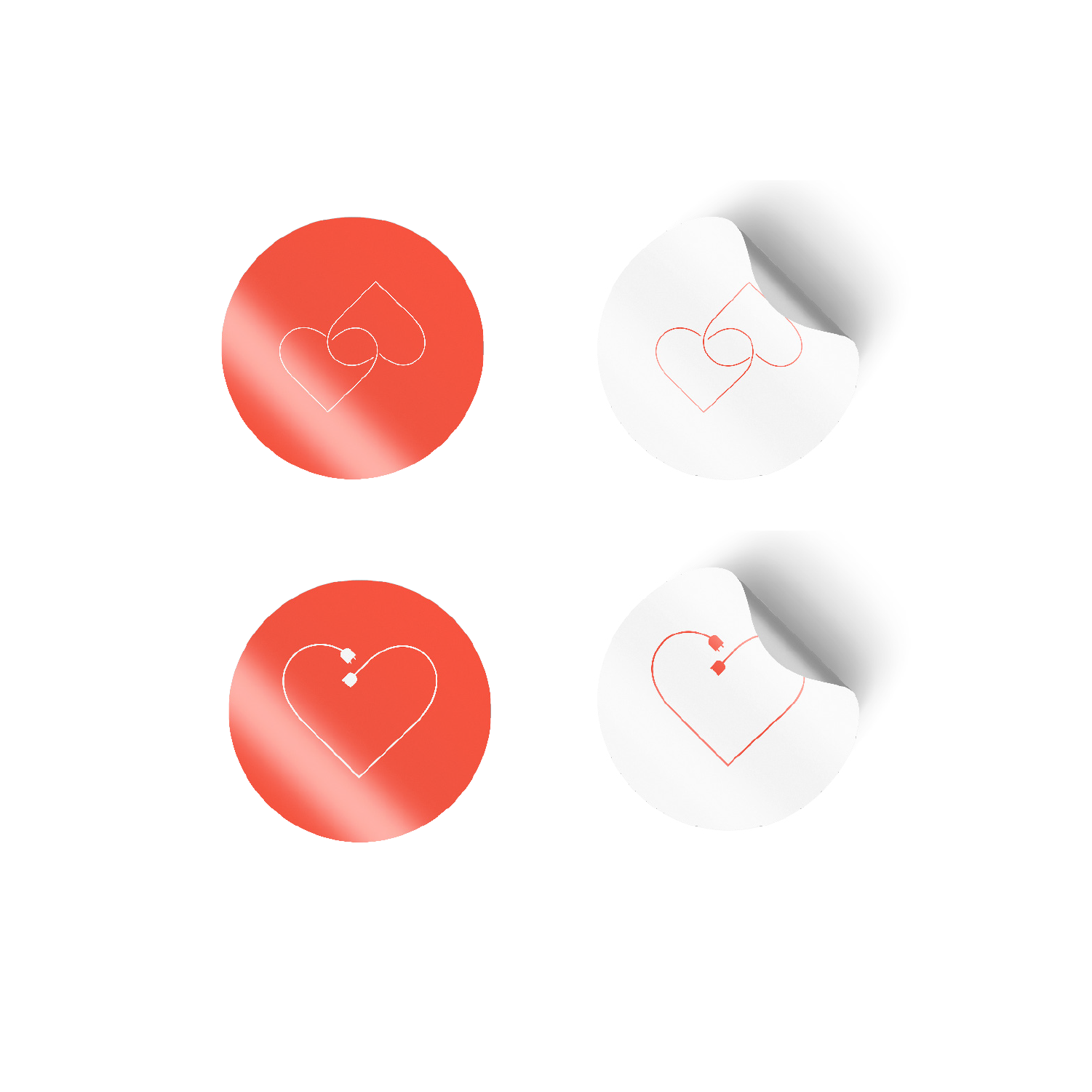
Stickers, which participants can place on their sleeves, in their journals, or anywhere else, promote event visibility.
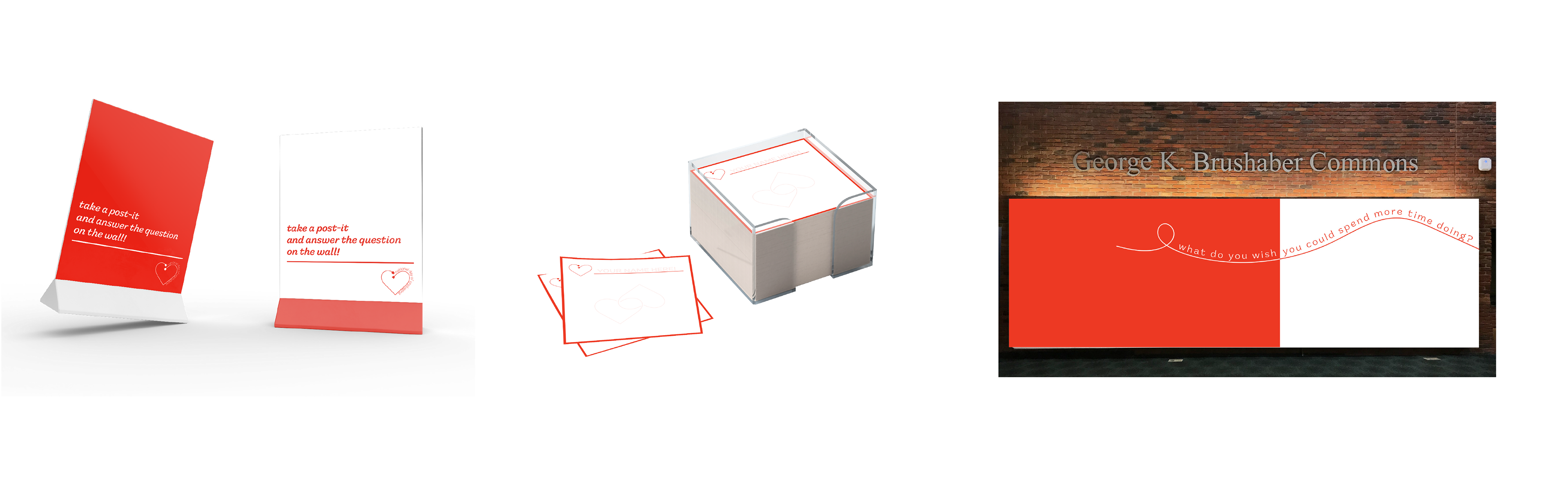
The display wall encourages students to take a custom sticky note, answer the question, and add their contribution to the vinyl-printed wall. This way students can not only see tangible evidence of participation by their community but engage in activity without using their phones.
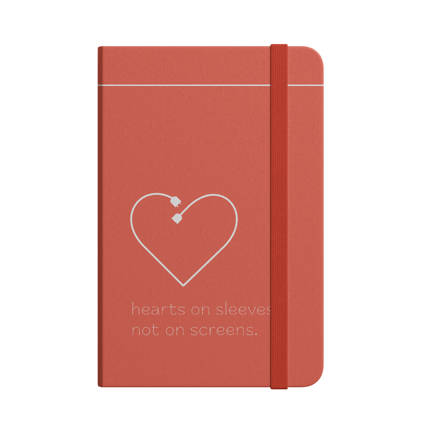
Branded journals encourage time for independent reflection after engaging in community-building activity in a shared space.
camp wapogasset rebrand
Through the creation of a yearly theme and a logo and promotional rebrand, this Christian summer camp in Wisconsin reaches a new height of appeal to a wide age range of fourth to ninth-grade campers. Playing into the outdoorsy and nature-based camp center while remaining rooted in scripture, the brand initiative packs the camp’s central values into a recognizable and visually implementable marker of camp identity.
After thorough research of Wapo's website and existing branding, similar initiatives by other camps, and visual inspiration from sermon and camp stage branding, I drew the conclusion that Wapo's focus is on its Christ-centered roots and lakeside location. The best camp themes capitalize on both visual and verbal potential.
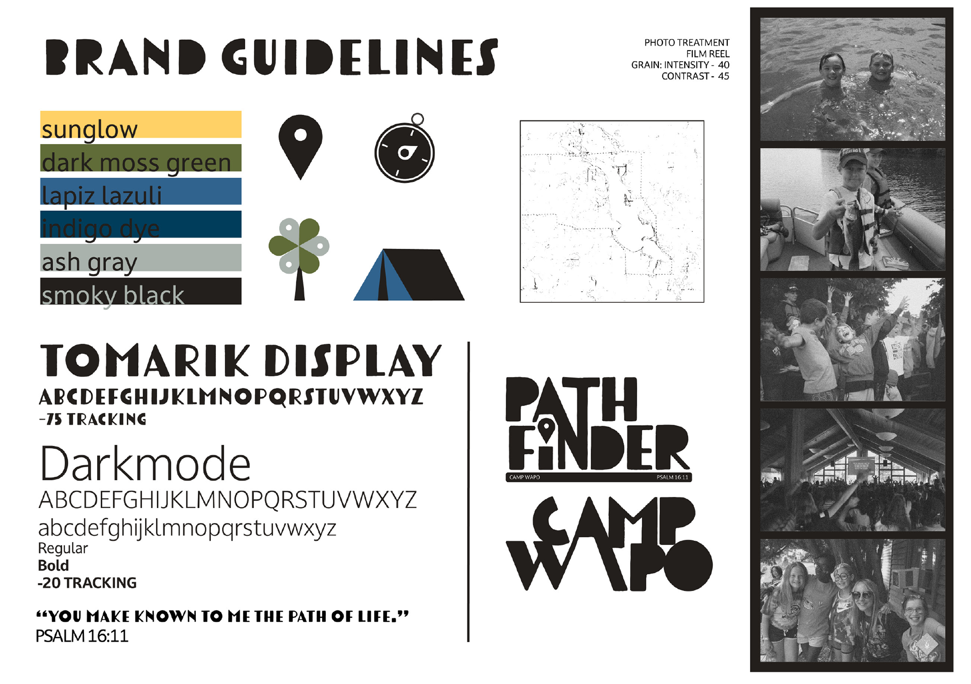
The final brand guidelines used an adapted version of Tomarik Display to create blocky, recognizable wordmarks for both the camp itself and the annual theme. Photo treatment was designed to make the impression of a film reel reminiscent of summer camp-typical disposable cameras. The primarily cool color scheme with a splash of yellow serves to evoke the outdoorsy nature of the camp, and a bank of simple, flat iconography and a stylized map background of the lake and surrounding area act as a background pattern throughout the brand initiative.
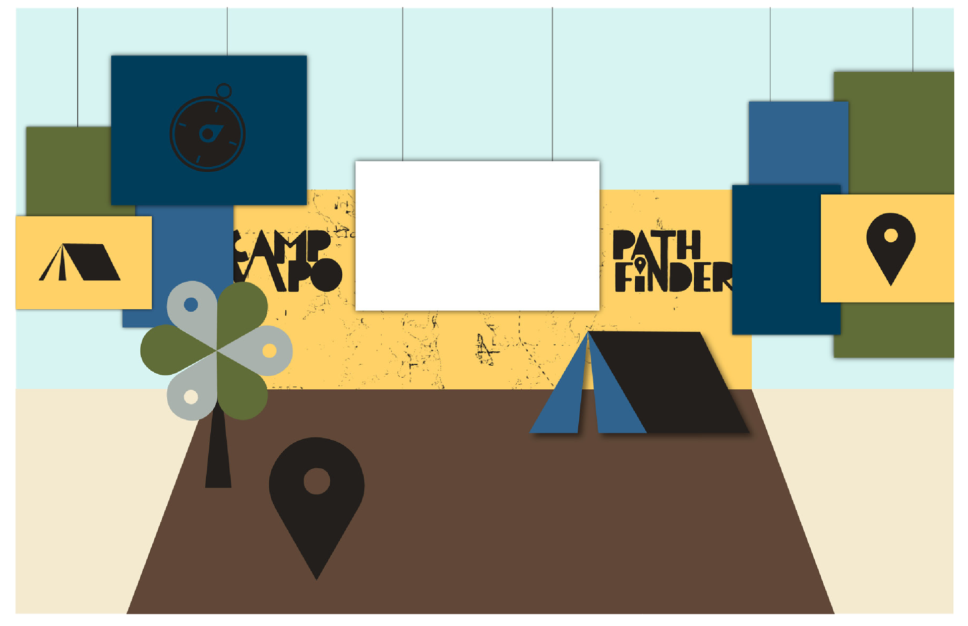
The main stage space is designed with hanging painted cardboard. The back wall consists of a vinyl print showcasing a map of the lake, the camp logo, and the theme icon. The items in the foreground represent more painted cardboard cutouts that free-stand as props for skits. In the center, there is a designated space for the projection screen that displays song lyrics and images.
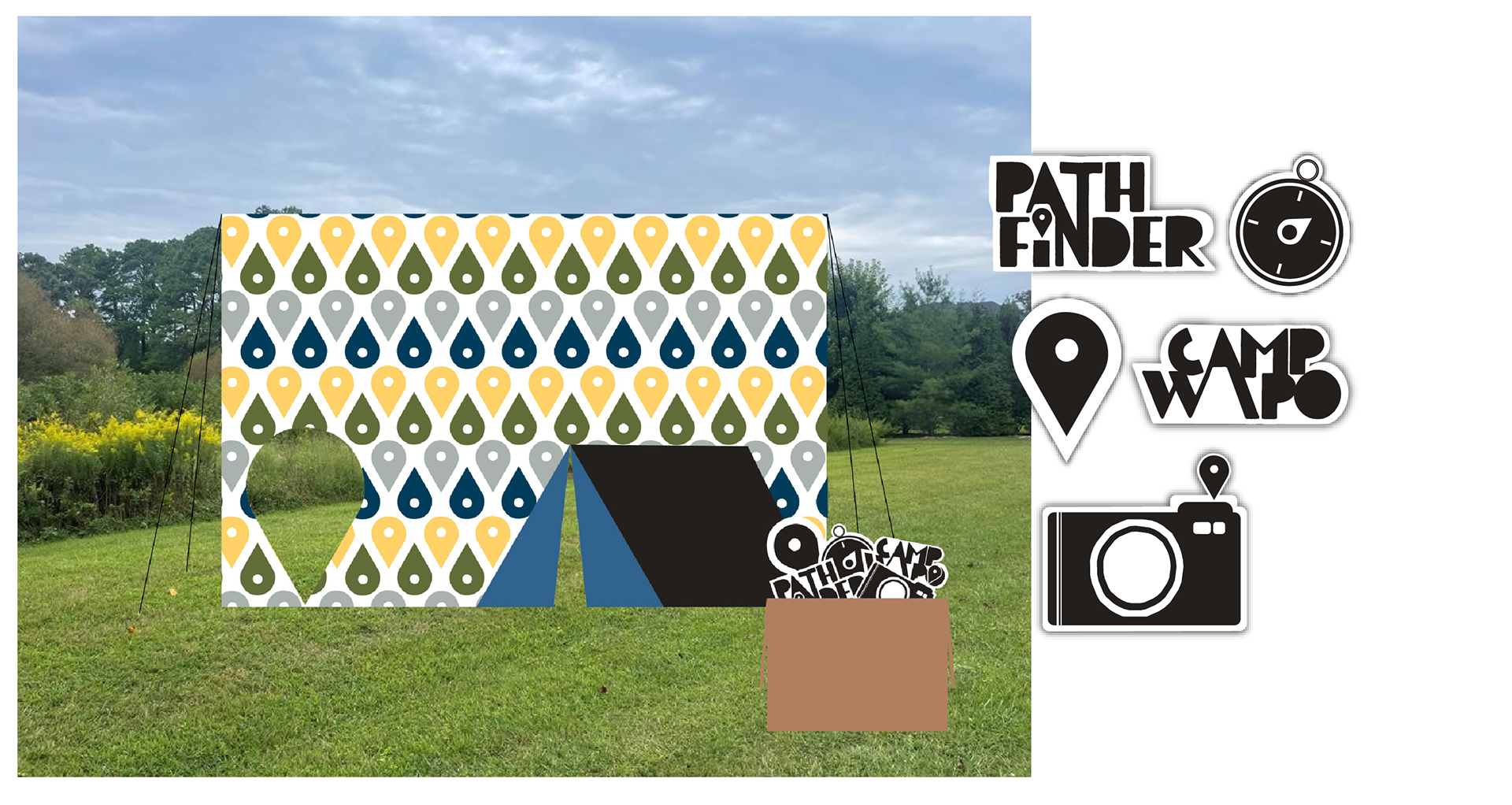
The vinyl-printed photo background has cutouts for campers to pose behind, and the props are once again painted cardboard cutouts. The vinyl is mounted on a pole frame and staked to the ground. The use of cardboard makes these experiential design options easy to implement and affordable.
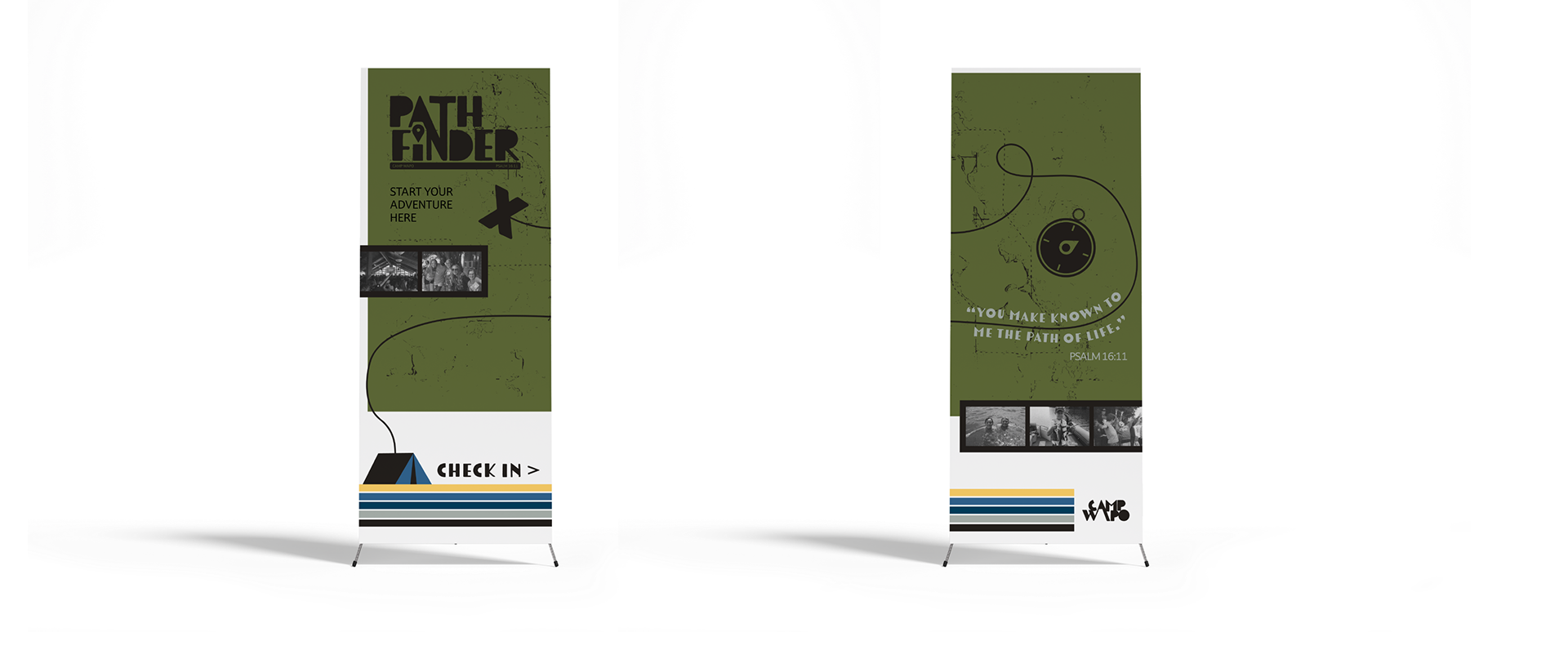
These banner stands are designed to be placed at check-in and registration tables, directing campers and families to the appropriate areas while comprehensively introducing the summer’s theme.
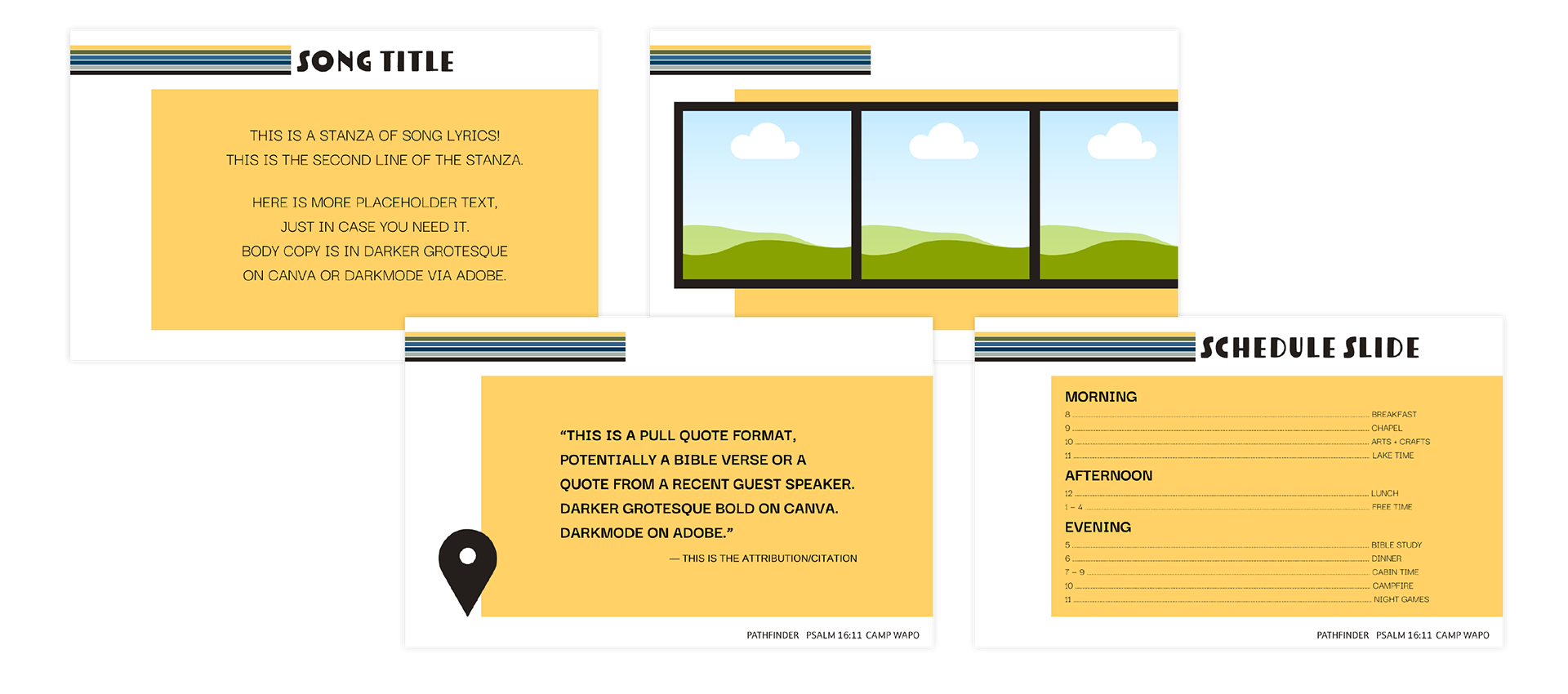
These slide templates, intended for the projection screen shown in the stage design, are designed in InDesign but can easily be input into a 1280 x 800px Canva presentation. This makes slides easily customizable for those and without access to Adobe Creative Suite. Darker Grotesque is a free alternative sans serif typeface accessible in Canva.